The Option I Chose Was…
Option2:Target
I Chose It Because…
I chose the word “Target” because it represents focus, precision, and a clear objective. The concept of having a specific goal and aiming towards it aligns with my personal and academic aspirations.
I Chose This Imagery and Colour Scheme Because…
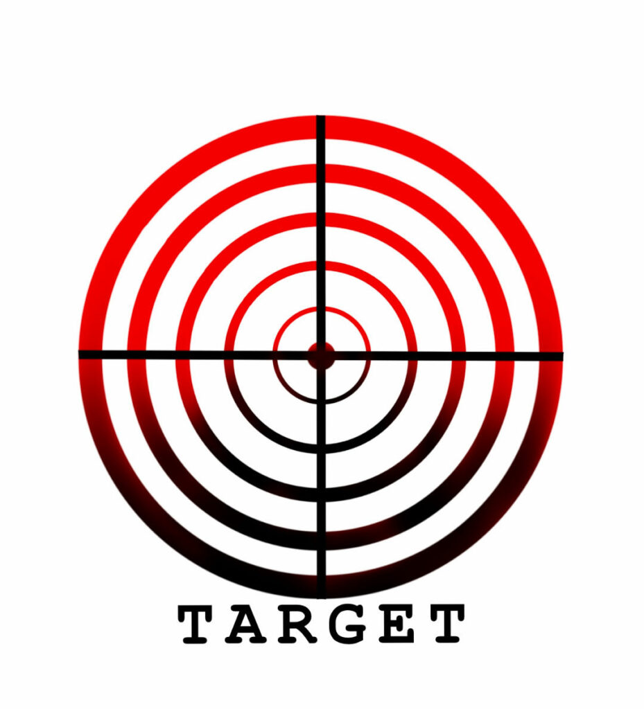
- Imagery: The target symbol is universally recognized and clearly conveys the idea of aiming for a specific goal. The concentric circles draw the eye to the center, emphasizing precision and focus.
- Colour Scheme: The use of red and black was deliberate. Red is a strong, attention-grabbing color that symbolizes energy, power, and determination. Black adds contrast and depth, highlighting the importance and intensity of the target.
The Elements and Principles of Design (Es, Ps), and Image Development Strategies That Feature in My Design Are…
- Elements of Design: Line, shape, and color. The concentric circles and the crosshair lines create a strong, focused composition.
- Principles of Design: Balance, emphasis, and contrast. The symmetrical arrangement of the circles and lines creates a balanced and harmonious design, while the contrast between red and black adds visual impact.
- Image Development Strategies: Enlarging the central target, adding a gradient effect to the circles to create depth, and experimenting with color intensity to emphasize the center.
What I Like About This Work Is…
I like how the simplicity of the design effectively conveys the concept of focus and precision. The strong visual impact of the red and black color scheme also appeals to me, as it draws attention and communicates intensity.
What I Found Challenging About This Work Was…
Finding the right balance between simplicity and impact was challenging. Ensuring that the design remained clean and focused while still being visually engaging required careful consideration. Additionally, working with color gradients to create depth without overwhelming the design was a delicate process.
I Was Inspired By…
I was inspired by the universal symbol of a target and its association with goals and achievements. The concept of aiming for a specific point and striving to hit the mark resonates with my own experiences and aspirations. The use of bold, contrasting colors was influenced by modern graphic design principles that emphasize clarity and impact.
Recent Comments